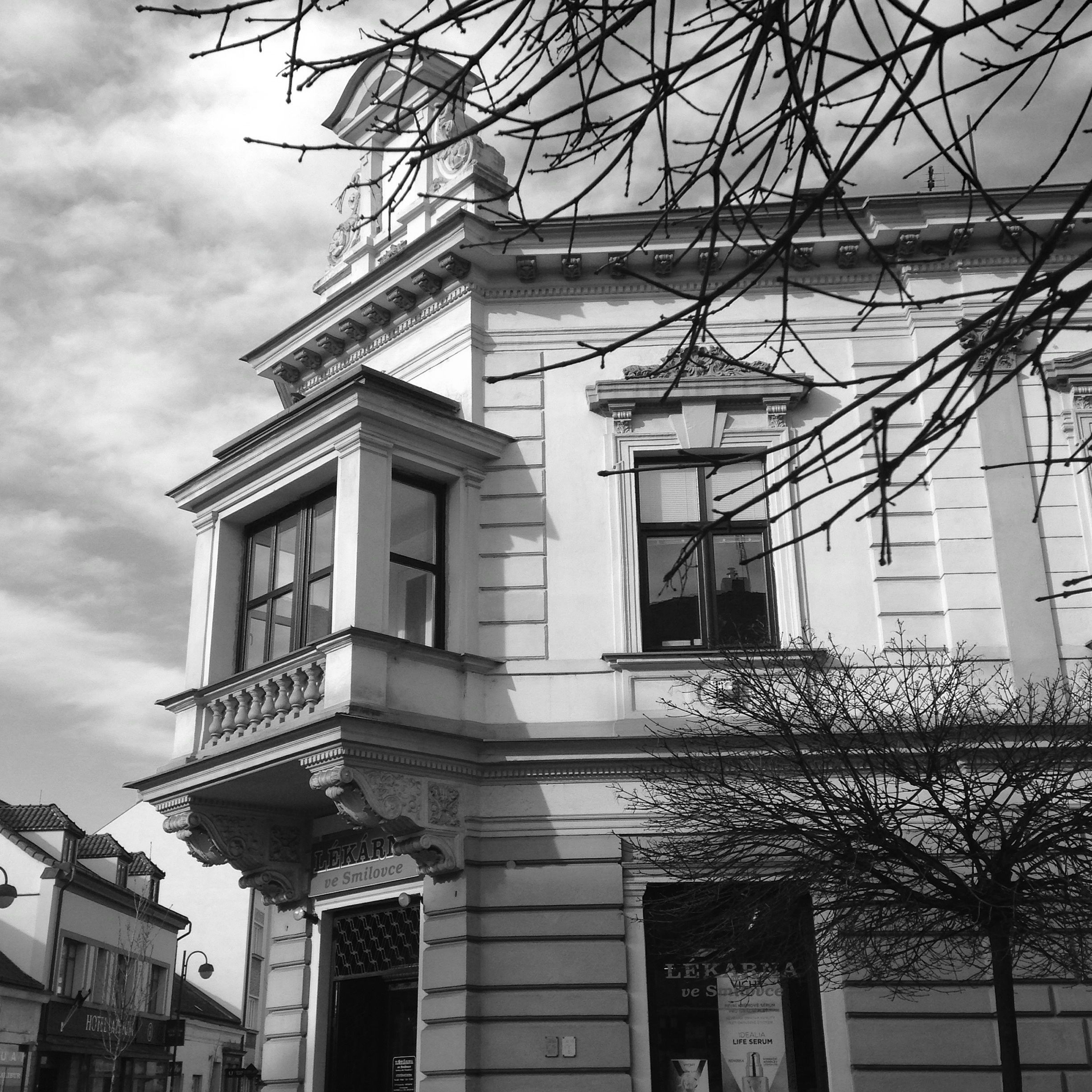
I love streets of Pardubice! I’ve already made some photos of them for Photo101’s assignment “Streets”. Today’s theme is “Architecture” and I went outside to snap some details. We were asked to play with black and white as well, and here’s an example of the difference it can make:
VS

Which one do you prefer? To be honest, on such a wonderful sunny day it was too hard for me to make all photos B&W, especially considering that the streets of Pardubice can be so colourful! Here’s more colour therapy for you ;)
© TinyExpats and http://www.tinyexpats.com, 2014-2015. Unauthorized use and/or duplication of this material without express and written permission from this blog’s author and owner is strictly prohibited. Excerpts and links may be used, provided that full and clear credit is given to TinyExpats and http://www.tinyexpats.com with appropriate and specific direction to the original content.

Beautiful! I love the black and white! It is moody indeed!
LikeLiked by 1 person
I always love B & W photos, especially if you can ramp up the contrast and really make them pop. Sometimes I find it hard to lose the colour in certain photos, but it depends on what the colour is. I like the B & W version above more because I don’t think the colours add anything extra that you can’t see in B & W, whereas the great photos at the bottom have much more significant colour. Nice job! :)
LikeLiked by 2 people
Thank you :) Yes, whereas I could make the first photo b&w, I really couldn’t make myself do that to the rest :)
LikeLiked by 1 person
I wouldn’t have either ;)
LikeLiked by 1 person
Lovely shots!!
LikeLiked by 1 person
Thank you!
LikeLiked by 1 person
What a beautiful town but I also prefer the B&W. It does give a wonderful moodiness to the photograph.
LikeLiked by 1 person
Yes, it is :) I agree, here b&w makes it more interesting.
LikeLike
I love the B&W as it shows off more sharpness. The colors in Pardubice buildings are brilliant. Great capture.
LikeLiked by 1 person
Thank you! It’s a great idea to paint houses like that – makes such a difference, adding that feel good factor.
LikeLiked by 1 person
Wow, you’re photos are inspiring. Glad to have found you at the blog party.
LikeLiked by 1 person
Thank you :) I’m doing photo101 course now, hence lots of photos. But I feel like coming out of hibernation with these sunny days here, so want to snap more :) Following you now as well!
LikeLike
Makes a lot of difference with colours – a happy, springy picture definitely! Love the colour on the sky. BW does feel moody…A little haunting even, and mysterious! Great capture though!
LikeLiked by 1 person
Thanks a lot :))
LikeLike
Great use of colour to emphasise the differences monochrome makes,great choice of viewpoints too.
LikeLiked by 1 person
Thank you!
LikeLike
Lovely colors! With such houses I would have chosen color any day! I wish you a good day!
LikeLiked by 1 person
Thank you! Have a nice day as well!
LikeLike